
Talking with John Jass about designing the cross for the Chapel on the Beach
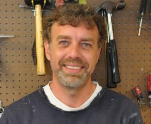
In his role as Camp caretaker (1994-2015) John Jass built – and rebuilt – many things at RKD. Those shelving units in Inn rooms? John. The Wigwam expansion? John. The playground with the sand pit? John. But John isn’t just a builder; he is really an artist who builds. Jass studied art and design in college, specializing in sculpture, then entered a master’s program in landscape architecture. This training left him with a highly developed sense of three-dimensional environments and a clear understanding of what makes for good design. As Caretaker, John’s overall approach to design was that any project needed to reflect or further Camp’s mission. If he built something new, his goal was that it should feel as if it had always been there; it should conform to the existing style and support the principles of Camp. (In fact, John related that his highest compliment as a designer/builder was an unwitting one – he was sitting with a guest in the Round Up when the guest asked when the Wigwam renovations would happen. In reality, the renovation had ALREADY happened, and John took it as a compliment that the guest hadn’t noticed!)
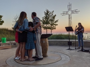
Jass’ design skills are evident throughout the entire Chapel on the Beach, where he chose materials and textures that would blend into the environment, creating a space that feels integrated into the landscape. Every element was carefully considered, and that same care went into his design of the Chapel cross. John stated that the cross project was the first time he created something for RKD without any artistic constraints, which was a daunting task. A cross is an ancient symbol laden with meaning, and John wanted this cross to be appropriately meaningful for its setting on the lakefront at Camp Arcadia.
Good designers approach projects purposefully, first about what message or theme they would like to convey, then about how to articulate that message using the various elements of design. John’s theme was that the cross is an “intersection of opposites” – a paradoxical place where competing ideas come together in both figurative and literal ways. (For example, the crossed beams can represent the literal incarnation of Jesus Christ: the place where God (vertical bar) and humans (horizontal bar) meet.) Many theologians and artists have explored these contradictions, noting that the cross simultaneously represents death AND life, humanity AND divinity, ugliness AND beauty, sin AND redemption. Jass wanted to create a cross that incorporated and depicted those paradoxes.
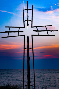
He started with materials. He knew that he wanted to incorporate natural elements, as nature is an important part of the RKD experience and evokes feelings of God. Wood was the natural choice. But there also needed to be a manufactured element, representing the opposite. He decided on metal. Once the elements were in place, he grappled with the design. He continued the idea of opposites not just with materials, but structure. A traditional wooden cross is heavy and solid; what if his was the opposite? What if the wood, which is traditionally sanded and planed, was left rough? What if the metal, which is often rigid and straight, was curved and graceful? What if the metal “human” elements worked in harmony with the wooden “God” elements, creating a cross that was actually substantial but seemed light? What if it was the most important visual element of the space, but also allowed one to see through it to the beauty beyond? And, most ironically – what if this “intersection of opposites” had no intersection at all?
This is what Jass designed. While the cross appears harmonious overall, it is actually irregular all over. The beams are different lengths and retain their individual knots. The metal arms are not the same length throughout. Instead of heavy planks, he used slender tree trunks for the beams and made them seem even lighter by “suspending them” from a metal framework with a generous amount of visual space between them. Where the beams would usually intersect, Jass created a space instead. But if there was no intersection, how would the cross work structurally?
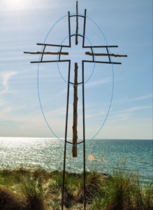
The answer would have to be in the metal framework. He started experimenting with the materials, drawing different shapes on the floor of his workshop. At one point, he saw he’d drawn two ovals, and he stopped. This was the solution. The wooden pieces would be connected to the metal framework by two ovals, providing both support and symbolism. Looking at the cross, you can just see the two nested “eggs” surrounding the cross. These eggs can represent resurrection, or creation, or our spiritual journey from a small, human understanding of God to a larger egg of greater understanding. John also intentionally made the wooden arms extend past the metal framework to suggest both that God is greater than humans and to depict God reaching out to us, stretching beyond our capabilities. Jass knew this design was inspired when he saw something there that he hadn’t even intended: in the negative space formed in the center of the design emerged a new, small cross, bounded by the metal oval and incorporating the edges of the wooden bars.
The result is an ethereal cross which allows the viewer to behold at once the splendor of Lake Michigan and the peculiar beauty of the cross and all it symbolizes. You can see God through it, within it, and around it, and the more I look, the more inspired I feel. I hope the next time you are at Camp you take a moment to reflect at the foot of the cross – not to revere its creator, but our Creator, who has blessed folks like John with the ability to reflect the very mystery and magnitude of God within the art they create.
5 Responses
I never have heard the story behind the cross. I knew that John Jass had designed it, but the message is perfect!
What a gift for ages to come. This story needs to be published more often.
Theology of the Cross!
Many books have been written on the subject. John’s interpretation is inspired and inspiring. So happy this story was researched and published. It needs to be retold every week at Camp! Thanks!
Thank you for sharing! I have loved the cross at the Chapel on the Beach since it was installed. Now I have an even deeper love for it knowing all that it stands for. I have never taken the time to put down in words what this cross means to me,, but the last paragraph of this article is a perfect description. Thank you, John, for sharing your artistic talent with Camp Arcadia. Retelling this story each week at Camp is a great idea!
I can’t believe I never knew or heard this story before! So grateful for John’s thoughtfulness in designing it. I’ll appreciate this cross even more now.
Thank you, John , for your design. The story of its inspiration is awesome.
I love that cross, especially at sunset. It is so special that I used it on the memorial folder for Jerry’s funeral and plan to have it on our headstone.
Camp has been a special part of our life for over 40 years. Thank you for all your work preserving and improving it.
Blessings, Sharon Allaire
PS I hope the cross isn’t copyrighted!